Neo-Brutalist Template

Neo-Brutalist Template

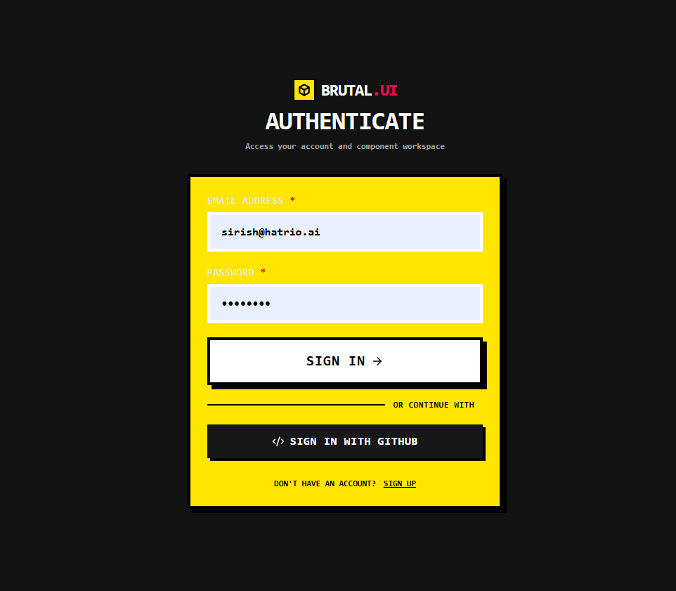
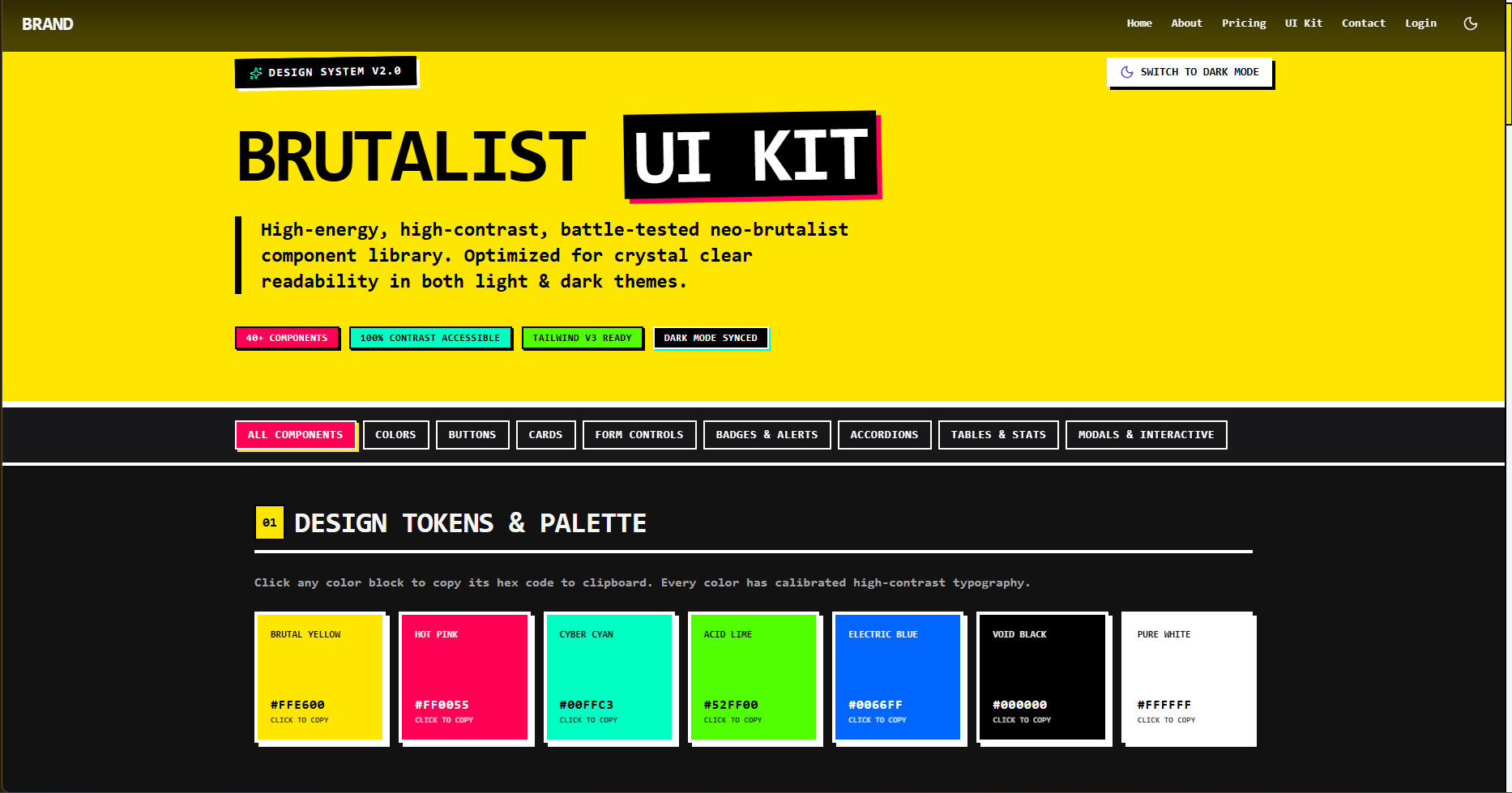
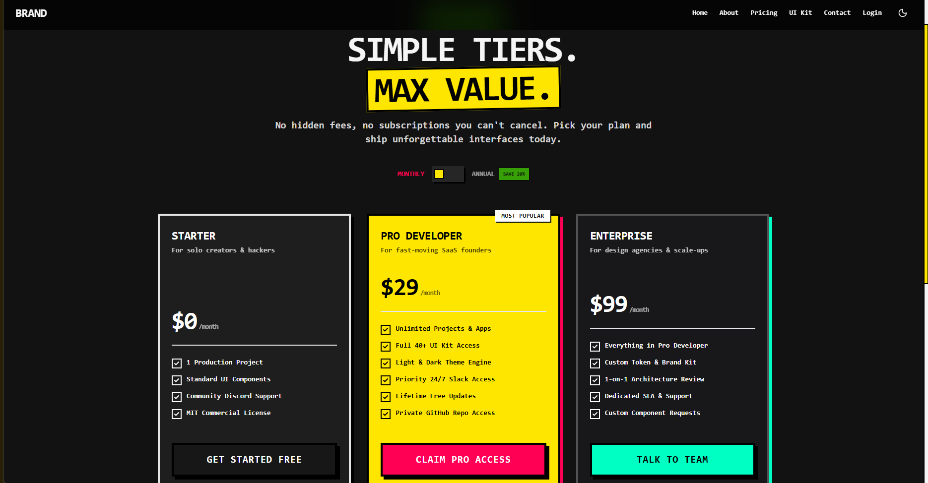
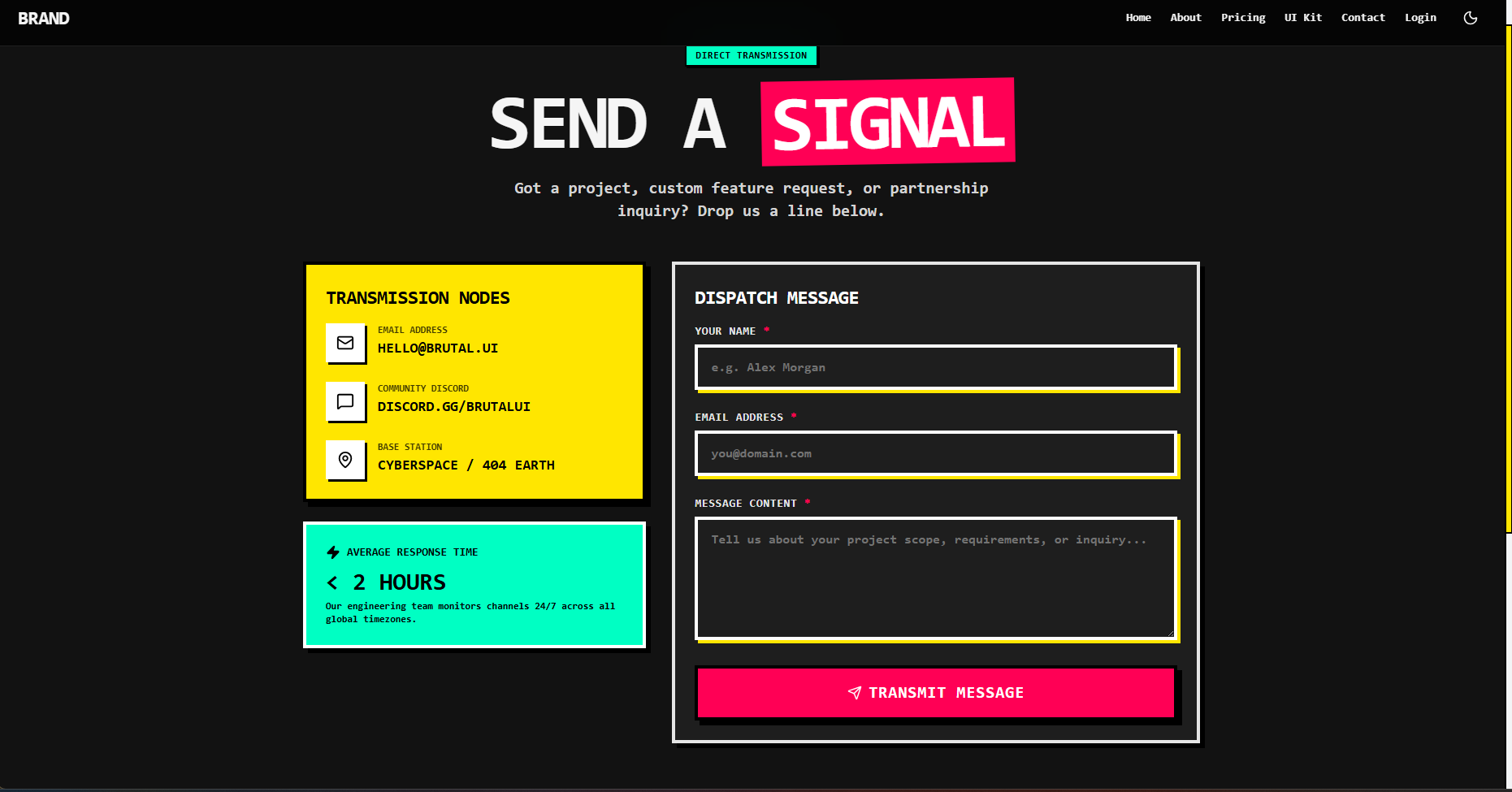
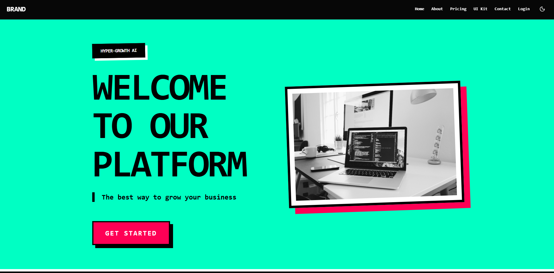
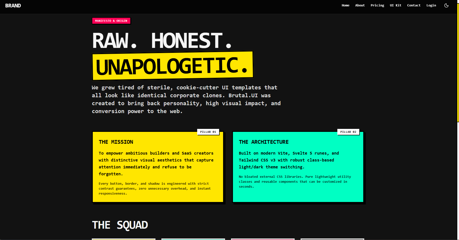
Brutal.UI brings personality, high visual impact, and conversion power back to the web. Designed around the modern Neo-Brutalism aesthetic, this template combines retro brutalist typography and chunky tactile borders with smooth modern micro-interactions. Every component is calibrated for strict 100% text readability and contrast compliance, guaranteeing that cards, badges, inputs, and buttons look razor-sharp in both light and dark modes. Key Highlights & Features 40+ Interactive UI Components: Full arsenal of buttons, multi-variant cards, custom form controls, retro toggle switches, status badges, alert banners, expandable accordions, tables, and modals. Dual Theme Engine (Light / Dark Mode): Seamless class-based theme synchronization with localStorage persistence and zero-flicker transitions. Guaranteed High-Contrast Typography: Explicit color pairings (e.g. Jet-Black on Electric Yellow, Crisp White on Hot Pink) ensuring zero unreadable or faded text. Pre-built Production Pages: Landing Page: High-voltage hero section, animated marquee banner, features grid, product showcases, testimonials, and FAQ accordion. UI Kit / Component Library: Interactive testing ground with one-click color code copying, live click counters, and modal triggers. Pricing Page: Dynamic Monthly vs. Annual toggle with tier breakdown. About & Contact Pages: Brand manifesto, team grid, and styled message dispatch form. Auth & Dashboard: Neo-brutalist login/register screens and a command center with real-time KPI metrics and order tables. Modern Tech Stack: Powered by Svelte 5, Tailwind CSS v3, Vite, and Lucide Icons for instant load times and zero bloat.

s
sirish August 31, 2026
New
No reviews yet
0
Downloads
90-Day Access $10.00

Overview

Brutal.UI brings personality, high visual impact, and conversion power back to the web. Designed around the modern Neo-Brutalism aesthetic, this template combines retro brutalist typography and chunky tactile borders with smooth modern micro-interactions. Every component is calibrated for strict 100% text readability and contrast compliance, guaranteeing that cards, badges, inputs, and buttons look razor-sharp in both light and dark modes. Key Highlights & Features 40+ Interactive UI Components: Full arsenal of buttons, multi-variant cards, custom form controls, retro toggle switches, status badges, alert banners, expandable accordions, tables, and modals. Dual Theme Engine (Light / Dark Mode): Seamless class-based theme synchronization with localStorage persistence and zero-flicker transitions. Guaranteed High-Contrast Typography: Explicit color pairings (e.g. Jet-Black on Electric Yellow, Crisp White on Hot Pink) ensuring zero unreadable or faded text. Pre-built Production Pages: Landing Page: High-voltage hero section, animated marquee banner, features grid, product showcases, testimonials, and FAQ accordion. UI Kit / Component Library: Interactive testing ground with one-click color code copying, live click counters, and modal triggers. Pricing Page: Dynamic Monthly vs. Annual toggle with tier breakdown. About & Contact Pages: Brand manifesto, team grid, and styled message dispatch form. Auth & Dashboard: Neo-brutalist login/register screens and a command center with real-time KPI metrics and order tables. Modern Tech Stack: Powered by Svelte 5, Tailwind CSS v3, Vite, and Lucide Icons for instant load times and zero bloat.

Gallery
ScreenshotScreenshotScreenshotScreenshotScreenshot

Content Locked

Purchase this file to read the full editorial description and instantly download the assets.

Reviews

No reviews yet.